by Ber | Apr 5, 2026 | Brand & Design
There was a moment — historians will debate exactly when, but sometime around 2016 — when someone in a Human Resources department opened Instagram, saw a competitor’s “day in the life” reel featuring beanbag chairs and cold brew on tap, and thought: “We need that.” Not the beanbag chairs. Not the cold brew. The perception. The carefully curated illusion that working at their company was less a job and more a lifestyle choice, like CrossFit or veganism but with dental insurance.
Thus employer branding was born. Or rather, reborn — because companies have always marketed themselves to potential employees. They just used to do it honestly: “We pay competitive salaries and you get three weeks off.” Now they do it with drone footage of the office, testimonials from suspiciously photogenic employees, and a careers page that reads like the manifesto of a particularly earnest co-working space. Welcome to the awkward marriage of HR and Marketing, where nobody agrees on the message and everyone agrees on the beanbags.
The Authenticity Arms Race
The central paradox of employer branding is that it demands authenticity while being, by definition, a marketing exercise. You cannot simultaneously “show the real culture” and “attract top talent” without editing. Every employee testimonial is selected, coached, and approved. Every office photo is staged, lit, and filtered. Every “we’re not perfect, but we’re working on it” statement has been reviewed by Legal, revised by Communications, and sanitized until the imperfections themselves feel curated.
The result is a genre of content that everyone recognizes as performance and nobody trusts. Job seekers scroll through careers pages the way they scroll through dating profiles: aware that the photos are the best-case scenario, that the bio emphasizes strengths and hides red flags, and that the reality will be revealed approximately three weeks after commitment. The company says “we value work-life balance” and the candidate mentally translates this to “we would like to value work-life balance but have not yet figured out how.”
The authenticity arms race has created its own absurdities. Companies now hire photographers to capture “candid” moments that are anything but candid. They produce “unscripted” employee videos with production values that would make a documentary filmmaker envious. They share “behind the scenes” content that has been through more review cycles than the annual report. It’s a hall of mirrors where everyone is performing naturalness, and the performance is so polished that it achieves the opposite of its intent. Much like putting a Spreadsheet Sloth on a motivational poster — the dissonance is the point. Grab yours from the NoBriefs shop.
The Turf War Nobody Admits Exists
Employer branding sits in the organizational chart like a child of divorced parents who both insist they have custody. HR owns the employee experience, the culture, the policies, and the onboarding. Marketing owns the brand, the visual identity, the tone of voice, and the content strategy. Employer branding needs both, belongs to neither, and is usually managed by whichever department had budget available when the initiative was approved.
This creates a tonal schizophrenia that’s visible from space. The careers page, built by Marketing, is sleek, aspirational, and on-brand. The job descriptions, written by HR, read like legal documents crossed with a wish list from a hiring manager who wants a unicorn at a donkey’s salary. The social media content alternates between polished brand videos and awkward photos of the office birthday celebration where Dave from Accounting is caught mid-sneeze. The employee value proposition promises “growth, impact, and belonging” while the Glassdoor reviews mention “micromanagement, unclear promotion criteria, and a kitchen that’s never clean.”
The turf war isn’t just about control. It’s about fundamentally different worldviews. HR thinks in terms of policies, compliance, and employee satisfaction surveys. Marketing thinks in terms of narratives, audiences, and conversion funnels. When these worldviews collide on a careers page, you get a document that’s simultaneously trying to comply with employment law and create an emotional brand connection. It’s like asking someone to write a love letter in legalese.
The Glassdoor Reckoning
The cruelest thing about employer branding is that it exists in the same internet as Glassdoor, Blind, Reddit, and every other platform where current and former employees share unfiltered opinions. You can spend six figures on a careers video and a disgruntled ex-employee can neutralize it with a three-star review and two paragraphs about the toxic middle management layer.
This isn’t a bug. It’s the market correcting for decades of corporate dishonesty. Before the internet, companies controlled their employer narrative completely. The only way to know what it was like to work somewhere was to know someone who worked there. Now, the information asymmetry has flipped. Candidates often know more about a company’s internal culture than the recruiter pitching them the role. They’ve read the reviews. They’ve seen the Reddit threads. They’ve decoded the job description’s euphemisms: “fast-paced” means chaotic, “wear many hats” means understaffed, and “competitive salary” means we’ll offer you the minimum we think you’ll accept.
The companies winning the employer branding game aren’t the ones with the best content. They’re the ones where the content matches the reality. Where the careers page and the Glassdoor reviews tell roughly the same story. Where the employee testimonials don’t require employees to pretend they work somewhere better than they do. This is rare, which is exactly why it works when it happens.
The Way Forward (If There Is One)
The future of employer branding isn’t more polished content. It’s less polished promises. It’s companies admitting, publicly and specifically, what they’re good at and what they’re not. It’s job descriptions that say “this role is demanding and the hours are long, but the work is meaningful and the team is exceptional” instead of pretending every position is a perfect balance of challenge and comfort.
It’s recognizing that employer branding isn’t a campaign. It’s a mirror. You can polish the mirror all you want, but it’s still going to reflect whatever’s standing in front of it. The best employer brand strategy isn’t better marketing. It’s a better workplace. Everything else is just KPI Shark metrics — impressive on a dashboard, meaningless in the hallway.
Stop selling the dream. Start fixing the reality. And if you need a reality check that fits in a coffee mug, the NoBriefs shop has options for every level of corporate disillusionment.
by Ber | Apr 5, 2026 | Brand & Design
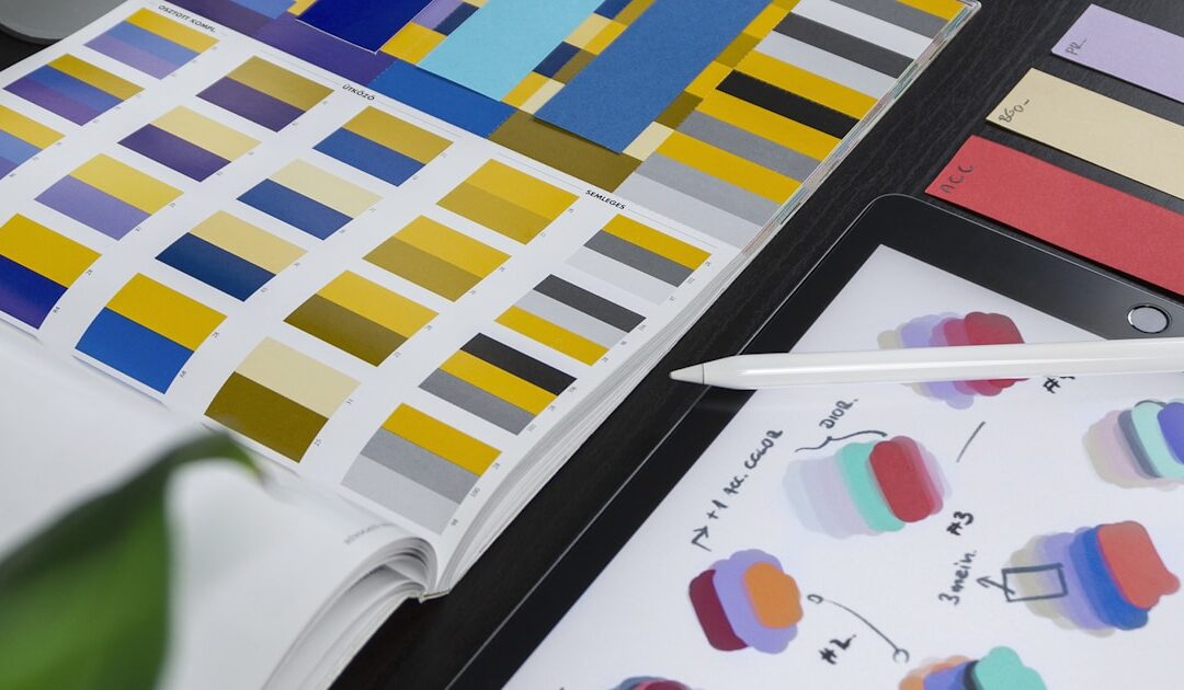
Open your phone. Look at your home screen. Count the blue icons. Facebook, LinkedIn, Twitter (yes, it’s still blue in spirit even if Elon painted it black), Zoom, Samsung, PayPal, Venmo, Dropbox, Skype. Your phone looks less like a collection of individual brands and more like a mood board for sadness. The entire digital economy has been bathed in a single color, and nobody in the branding industry wants to talk about why.
The official explanation involves color psychology, which is the astrology of design disciplines. Blue conveys trust, stability, professionalism. It’s universally inoffensive. It tests well across demographics. It works on light backgrounds and dark backgrounds. It’s accessible. It’s calm. It’s — and here’s the part they don’t say out loud — the safest possible choice for a decision-maker who is terrified of being wrong.
The Psychology Excuse
Color psychology is one of those fields where a kernel of legitimate research has been inflated into an entire consulting industry. Yes, colors carry cultural associations. Yes, warm colors tend to feel more energetic than cool colors. Yes, there are measurable differences in how people respond to different parts of the visible spectrum. But the leap from “blue has calming associations in Western cultures” to “your fintech startup must be blue or customers won’t trust you with their money” is the kind of logic that keeps branding agencies in business and the Pantone blue swatch collection in perpetual demand.
The truth is less scientific and more sociological. Blue became the default because the first major tech companies chose blue, and every company after that looked at the successful ones and said, “We should also be blue.” It’s not color psychology. It’s herd behavior with a design rationale bolted on after the fact. Facebook is blue because Mark Zuckerberg is red-green colorblind and blue was the color he could see best. That’s it. That’s the origin story of the most influential color decision in digital history. Not research. Not strategy. An accident of biology that launched a thousand copycats.
Yet try presenting a non-blue palette to a board of directors for a technology company. Watch the room temperature drop. Watch the CFO lean forward and ask, “But don’t users associate blue with trust?” Watch the CEO pull up Facebook on their phone as if a trillion-dollar company’s color choice is a peer-reviewed study. The psychology excuse isn’t driving the decision. The fear of being different is driving the decision, and psychology is the respectable-sounding justification.
The Committee Color Wheel
Every bold color choice begins in a designer’s studio and dies in a conference room. The journey is always the same. A designer presents three directions: one safe, one interesting, one provocative. The provocative one uses orange, or pink, or — God forbid — yellow. It’s distinctive. It’s memorable. It’s the one the designer has been refining at 2 AM because they genuinely believe it’s right for the brand.
The committee picks blue. Not because they evaluated each option on its strategic merits. But because blue is the only color in the presentation that nobody has a strong opinion against. Red is “too aggressive.” Green is “too environmental” (unless you are environmental, in which case green is “too expected”). Orange is “too playful.” Purple is “too luxury.” Pink is “too feminine” — a statement that reveals more about the committee than the color. Yellow is “hard to read.” Black is “too dark.” And blue? Blue is “professional.” Blue is “safe.” Blue is the color of not getting fired for a branding decision.
This is how design by committee works: not by choosing the best option, but by eliminating every option that makes someone uncomfortable. What remains isn’t a decision. It’s a default. The KPI Shark doesn’t swim in safe waters — and neither should your brand identity. Grab one from the NoBriefs shop as a reminder that playing it safe is the riskiest strategy of all.
The Brands That Broke the Mold (and What Happened)
The most iconic brands in the world aren’t blue. Coca-Cola is red and has been since the 1890s. Ferrari is red. McDonald’s is red and yellow. Spotify is green. T-Mobile is magenta and has literally trademarked the color. Hermès is orange. Tiffany’s blue is so specific and so owned that it’s less “blue” and more “a legal entity in color form.”
What these brands share isn’t a color. It’s conviction. They chose a color and committed to it with the kind of unwavering confidence that most branding committees can’t muster. T-Mobile didn’t become magenta because research said magenta conveys “innovative telecommunications.” They became magenta because it was impossible to confuse with AT&T blue or Verizon red. It was a competitive decision, not a psychological one. And it worked precisely because it was different.
The lesson isn’t that blue is bad. Blue is fine. IBM has been blue since before most of us were born, and it works for them. The lesson is that choosing blue because you’re afraid of choosing anything else isn’t a brand strategy. It’s a coping mechanism. And a brand built on fear of distinction is a brand that’s already decided to be forgettable.
The Brave New World of Beige
If blue is the coward’s choice for technology brands, the new frontier of chromatic conformity is the millennial-to-Gen-Z startup palette: soft gradients, muted pastels, and an inexplicable amount of lavender. Every DTC brand launched since 2018 looks like it was designed inside an Instagram filter. The colors whisper rather than speak. They suggest wellness, mindfulness, and the vague sense that someone with a curated bookshelf approved this.
This is blue-ification in a different costume. The impulse is identical — choose colors that won’t offend, that blend into the aesthetic of the moment, that signal belonging to a tribe rather than standing apart from it. The palette has shifted from corporate navy to millennial blush, but the underlying cowardice is the same. Nobody ever got fired for choosing a color that matches the current cultural vibe. And nobody ever built a legendary brand by matching the current cultural vibe, either.
Color in branding isn’t decoration. It’s a decision. It’s one of the few decisions that every single person who encounters your brand will process, consciously or not, in the first fraction of a second. It deserves more than a committee vote and a psychology article pulled from the first page of Google. It deserves Fuck The Brief energy — the audacity to choose something that makes the room uncomfortable and defend it with strategy, not safety.
Your brand is not a democracy, and your color palette is not a compromise. Pick something that means something. Pick something that scares the committee. And if they insist on blue, at least make sure it’s the most aggressive, unapologetic blue they’ve ever seen. More brand heresies at nobriefsclub.com.

by Ber | Apr 4, 2026 | Brand & Design
You know the video. You’ve seen it a hundred times. It opens with a sunrise. Or maybe a time-lapse of a city waking up. There’s a piano playing — something minimal, tasteful, the kind of melody that says “we are a serious company having a serious moment.” Then a voiceover begins. It’s warm. It’s measured. It says something like, “In a world that’s constantly changing, one thing remains true.” And you think: yes, one thing does remain true. This video is going to cost four times what the logo redesign cost. And nobody outside the company will ever watch it.
The Genesis of Unnecessary Cinema
Every rebrand launch video begins with the same conversation. The new brand identity is done. The logo is approved. The color palette exists. The typography has been selected after a process that somehow took longer than the Treaty of Versailles. And then someone — usually the Chief Marketing Officer, fresh from the dopamine rush of signing off on a new wordmark — says: “We need a video. Something cinematic. Something that captures the essence of who we are now.”
The word “cinematic” is the most expensive adjective in the marketing vocabulary. The moment it enters the brief, the budget triples. “Cinematic” means drone footage. It means slow-motion close-ups of hands doing things — typing, building, pouring coffee, high-fiving in a sunlit office that looks nothing like any office anyone in the company has ever worked in. “Cinematic” means a soundtrack that was composed specifically for this project because stock music “doesn’t capture the emotion.” The emotion, to be clear, is a corporation changing its font.
The production company quotes six figures. The CMO approves it without blinking, because this is “a once-in-a-decade moment” and you can’t put a price on “telling our story.” You absolutely can put a price on it. It’s right there on the invoice. But the metaphor is more comfortable than the number.
The Script: A Masterclass in Saying Everything and Nothing
The script goes through fourteen drafts. The first draft was good. It was specific, honest, and slightly vulnerable. It said something real about why the company was changing. It got killed in the second review because the CEO thought it was “too self-deprecating.” The second draft was bold. It made a claim about the future that was exciting and ambitious. It got killed because legal said they couldn’t promise the future. The fourteenth draft says nothing. It is a collection of sentences that sound meaningful in sequence but dissolve upon contact with actual thought.
“We believe in the power of connection.” “Our journey has always been about people.” “Today, we take the next step.” “This isn’t just a new look — it’s a new commitment.” These sentences have appeared, in various combinations, in approximately every rebrand video ever made. They are the lorem ipsum of corporate emotion. They fill space where meaning should be. They sound like conviction but function as decoration.
A Fuck The Brief would have saved everyone six weeks and thirteen drafts.
The Premiere: Applause From an Audience of Employees
The video premieres at an internal all-hands meeting. The lights dim. The piano starts. Two hundred employees watch a two-minute film about their own company and try to feel something. Some succeed — not because the video is moving, but because they’ve been working 60-hour weeks on the rebrand and seeing it come together triggers a Pavlovian release of exhaustion-adjacent emotion. Others stare at the screen with the polite blankness of people watching an in-flight safety video for the fortieth time.
The CEO takes the stage afterward and says, “This is more than a rebrand. This is who we’ve always been.” This sentence is mathematically impossible — if it’s who you’ve always been, it’s not a rebrand — but nobody points this out because the applause has already started and the catering is ready.
The video is posted on LinkedIn. It gets 2,400 views. Eighty percent of those views are from employees. Twelve percent are from the production company’s team. The remaining eight percent are from competitors watching to see if the rebrand is better than theirs. It is not. But the video is nicer.
The Afterlife of a Launch Film
Within two weeks, the video disappears. Not literally — it’s still on YouTube, technically, in a playlist called “Brand Assets” with 340 lifetime views. But functionally, it ceases to exist. Nobody shares it with prospects. Nobody uses it in presentations. The sales team has never watched it. New employees joining six months later will never know it existed. It served its purpose: it made the rebrand feel important on the day it launched. Everything after that is just a very expensive entry in the company’s Vimeo account.
Meanwhile, the actual rebrand — the logo, the colors, the typography, the guidelines — will be used every day for the next five to ten years. It will appear on every email, every presentation, every product. It will define how the world sees the company. It cost a fraction of the video. But nobody made a cinematic film about it, so it feels less important. In the corporate hierarchy of perceived value, a two-minute video with a piano will always outrank the system that actually does the work. Form over function. Cinema over substance. This is the way.
If you’ve lived through this — if you’ve sat in that darkened room, watching drone footage of your office building while a voiceover explains your own company to you — NoBriefsClub.com gets it. Visit the shop and invest in something that will actually get used every day. Unlike that video.

by Ber | Apr 4, 2026 | Brand & Design
There is a moment in every brand’s life when someone decides the company needs to “understand who it really is.” Not in a practical sense — not market positioning or competitive differentiation or anything that might actually affect revenue. No, in a deeper, more spiritual sense. The brand needs an identity. A soul. An archetype. And to discover this soul, the company will pay a consultant somewhere between five and fifty thousand dollars to facilitate a workshop that ends with the revelation that your brand is “The Explorer.” You are an outdoor gear company. Of course you’re The Explorer. You could have arrived at this conclusion by reading your own website for thirty seconds, but instead you spent a full day in a conference room with Post-it notes and a facilitator named Marcus who kept saying “let’s sit with that.”
The Twelve Apostles of Brand Strategy
Brand archetypes are based loosely on Jungian psychology, which is a polite way of saying they’re based loosely on the idea that humans respond to universal character types. The Hero. The Rebel. The Sage. The Caregiver. There are twelve of them, which is a suspiciously convenient number — enough to feel like a framework, not so many that anyone gets confused. They were popularized in the early 2000s by a book that consultants cite the way medieval monks cited scripture: reverently, frequently, and without questioning whether it applies to their specific situation.
The framework isn’t entirely useless. The idea that brands benefit from consistent personality traits is sound. The problem is the execution. In practice, the archetype workshop follows a predictable arc: the facilitator presents all twelve archetypes on beautifully designed slides. Everyone in the room nods at “The Hero” and “The Rebel” because those sound exciting. Nobody wants to be “The Innocent” because it sounds naive, and nobody admits they might be “The Regular Guy” because nobody flew in for a workshop to learn they’re ordinary.
After two hours of discussion, the group converges on one of three archetypes: The Explorer (for any brand that sells anything remotely related to experiences), The Creator (for any brand that makes anything), or The Sage (for any brand that wants to sound smart). The archetype is chosen not because of rigorous analysis but because it flatters the leadership team’s self-image. Nobody has ever left an archetype workshop identified as “The Jester” unless the facilitator was exceptionally brave or the brand was already a comedy account.
The Deliverable: A Personality Slide Nobody Will Use
The workshop produces a deliverable. It’s always a PDF, beautifully designed, between 15 and 40 pages. It contains the chosen archetype, a mood board that looks like someone’s aspirational Pinterest account, a set of “brand personality traits” (always including “authentic,” because every brand in history has chosen “authentic” as a trait, which is the most inauthentic thing imaginable), and a section called “Tone of Voice” that describes how the brand should communicate.
The Tone of Voice section is the part that should be most useful and is, in practice, most ignored. It’ll say things like “confident but not arrogant, warm but not casual, intelligent but accessible.” These are not instructions. These are contradictions. Try writing a social media post that is simultaneously confident but not arrogant and warm but not casual. It’s like being told to paint something that is red but not red. The writer stares at the document, closes it, and writes whatever feels right. The document goes into a shared drive folder where it will be referenced exactly once — in six months, when a new team member asks “do we have brand guidelines?” and someone sends them the PDF with the caveat “I think this is the latest version, but don’t quote me.”
The Spreadsheet Sloth understands this feeling — the slow, inevitable slide of a deliverable from “essential strategy” to “abandoned Google Drive artifact.”
Why the Workshop Exists (And It’s Not Why You Think)
Brand archetype workshops don’t exist because brands need archetypes. They exist because organizations need consensus. The workshop is not a strategic exercise — it’s a diplomatic one. Its real function is to get twelve people in a room, let them argue about adjectives for six hours, and leave with the feeling that a decision was made. The archetype is the byproduct. The real product is alignment, or at least the feeling of alignment, which in corporate environments is functionally the same thing.
This is also why the results are always vague enough to be unchallengeable. No one can argue that the brand shouldn’t be “authentic” or “bold” or “human.” These words are semantic marshmallows — soft, sweet, and impossible to push back against. The entire framework is designed to produce agreement, not insight. And agreement, in most organizations, is the scarcest and most valuable commodity. Far more valuable than an archetype.
The Alternative Nobody Wants to Hear
Here’s the thing: your brand doesn’t need an archetype. It needs clarity. Clarity about what you sell, who you sell it to, why they should care, and what you’re willing to say that your competitors aren’t. That’s it. Four questions. No Post-it notes required. No Marcus. No full-day workshop with catered lunch and a breakout session where someone inevitably says, “What if we’re actually two archetypes?”
The best brands in the world don’t operate from an archetype deck. They operate from conviction. They know what they believe, they say it clearly, and they do it consistently. If your brand can’t articulate its identity without a Jungian framework and a consultant, the problem isn’t that you haven’t found your archetype. The problem is that you don’t have a point of view.
Find your point of view. Then find NoBriefsClub.com, where the only archetype we recognize is “The Creative Who Is Tired of This Nonsense.” Grab a Fuck The Brief and let your identity speak for itself.

by Ber | Apr 3, 2026 | Brand & Design
Once a year, with the seasonal reliability of a migratory bird, the annual brand tracker arrives. It comes in the form of a research presentation, usually delivered by a research firm that has been running this study since before some of the attendees were in secondary school. The deck is thick. The methodology is sound. The sample size is robust. The findings are, depending on your charitable disposition, either reassuring confirmation of existing intuitions or an expensive restatement of things that were already known, formatted as discoveries.
Brand awareness: 67%. Up two points year-on-year. Brand consideration: 34%. Flat. Net Promoter Score: 41. Slightly down but “within margin of error.” Top-of-mind awareness among the 25-34 demographic: “we’ll look at the cross-tabs.” The room nods. Someone asks about the competitor data. The competitor data is shown. Everyone notes that Competitor A has gained three points of consideration and spends forty minutes discussing whether this is methodological noise or a real signal. The meeting ends. The deck is shared. The findings are cited in the annual report. Nothing changes, and next year, the same research firm will return with a new wave of data showing movement within margin of error in every direction.
The Value of Knowing What You Already Thought
Brand tracking studies were designed to answer a legitimate question: is our brand getting stronger or weaker in the minds of the people we want to reach, and how does this compare to competitors over time? This is a real question with real business implications. Brand health does predict future revenue in ways that are sometimes invisible in short-term performance data. The investment in longitudinal tracking is, in principle, sensible.
The problem is what happens to the data. Tracking data is, by design, slow-moving. Brand metrics change over months and years, not weeks. They are resistant to short-term campaign activity in ways that quarterly reporting cycles cannot accommodate. This creates a structural mismatch: the data exists on a timeline that the organization doesn’t have the patience for, and the organization exists on a timeline (quarterly, annual) that the data doesn’t have the resolution to illuminate.
The result is a peculiar use of research: the brand tracker is consulted not to make decisions but to defend them. If awareness went up, the campaign worked. If awareness went down, it was “external factors” or “the competitive environment” or “a methodology note in appendix C.” The data is treated as confirmation when it confirms, and as noise when it doesn’t. The tracker is not a decision-making tool so much as a document of record — a regularly updated archive of things that happened to brand sentiment, filed under “things we measured.”
The Action That Never Follows the Insight
Brand tracking studies have a section, usually near the end of the presentation, called “Implications” or “Recommendations.” This section suggests what the brand should do differently based on the findings. The suggestions are typically: “strengthen emotional connection with the 35-44 segment,” “increase salience in the premium consideration set,” “address the perception gap on quality attributes.” These recommendations have appeared in brand tracking presentations for as long as brand tracking has existed. They are structurally incapable of being specific, because the data cannot be specific — it can tell you that emotional connection is lower than it should be, but not what creative execution would raise it, by how much, by when, or at what cost.
The implications slide is therefore a bridge to nowhere: it generates the appearance of actionability without the content of it. The next steps are to “develop a plan to address these findings,” which generates a workstream, which generates a workshop (see: the discovery phase), which generates a strategy deck (see: the insight that isn’t), which circles back, eventually, to the next annual brand tracker that will measure whether any of this had any effect. It’s a beautiful system if you appreciate circularity.
The Competitor You Can’t Stop Looking At
The most emotionally intense section of any brand tracker presentation is the competitive data. Your own brand numbers are processed with professional equanimity. Competitor numbers are treated with the scrutiny of a forensic accountant reviewing a suspicious receipt. If a competitor’s awareness is up, there is a twenty-minute discussion of why, which methodological factors might explain it, whether the sample was properly weighted, and whether the shift represents a genuine change or a statistical artifact. The possibility that the competitor ran a better campaign and more people now know about them is considered, then reframed as “an opportunity for differentiation.”
The competitive obsession in brand tracking is revealing. It suggests that the primary use of the data is not “are we building the brand we want?” but “are we ahead of the people we’re afraid of?” These are related but different questions. The first question is strategic. The second is anxious. Most brand tracking presentations answer the second question while pretending to answer the first.
The Use It Could Have
Good brand research is genuinely useful when it’s designed to answer specific questions, when the methodology is matched to the decision being made, and when the findings can actually change what happens next. Tracking studies, done well, can reveal shifts in brand health before they show up in revenue — a form of early warning that is worth the investment if the organization is actually willing to act on warnings.
The prerequisite is an organization willing to be told uncomfortable things and do something about them. Not willing to note them in the appendix, or explain them away with margin-of-error arguments, or add them to the list of things that will be addressed in Phase Two. Actually willing to change course. That organization is rarer than the research investment it would justify, but it exists, and when it does, the brand tracker earns its budget many times over.
For everyone else: the tracker arrives, the deck is presented, the findings are filed, and next year the same firm returns. It’s not fraudulent. It’s just expensive ritual. The NoBriefs shop runs its own kind of brand research: watching what resonates with people who are fed up, making more of that, and not commissioning a tracker to tell us what we already know from talking to our community. The KPI Shark has seen the competitive data. He is not impressed. He suggests you stop watching the competitor’s numbers and start making something worth watching.

by Ber | Apr 2, 2026 | Brand & Design
A rebrand is announced. There is applause, a PowerPoint deck with the word “transformation” in 48-point type, and a brand consultant charging €450 an hour who keeps saying “brand ecosystem.” There is a committee. There is always a committee. Six months later, you are staring at a new logo in a shade of blue that didn’t exist six months ago, wondering where things went wrong — and more importantly, how you are still employed.
Rebranding is the marketing world’s version of home renovation: everyone agrees it’s necessary, no one agrees on the tiles, and by the end, at least one load-bearing wall has been demolished by someone who watched a YouTube tutorial. The difference is that in a rebrand, the load-bearing walls are often the creative team, and the YouTube tutorial is the CEO’s nephew’s opinion on typography.
The Rebrand That Was Never Really About the Brand
Let’s start with the truth nobody says in the kickoff meeting: most rebrands aren’t triggered by market research, evolving consumer behavior, or genuine strategic need. They’re triggered by a new CMO who needs something for their LinkedIn, a competitor who changed their logo last quarter, or a board meeting where someone said “we need to feel more modern” and nobody pushed back hard enough.
This matters because it changes your entire role in the process. You’re not solving a brand problem. You’re solving a political problem with visual tools. The brief says “repositioning for a new generation of consumers.” What the brief actually means is “the incoming VP of Marketing hates our current identity and has the budget to do something about it.”
Once you accept this, you can stop arguing about whether the rebrand is necessary and start focusing on the only question that matters: how do you shepherd this thing to completion without losing what actually works, without getting fired for protecting it, and without producing something that will embarrass you in five years?
The Committee That Never Stops Giving
Every rebrand has a steering committee. The steering committee has no steering capabilities whatsoever — it exists purely to ensure that every decision takes three times longer than it should and arrives at a place no individual member would have chosen alone. This is not a bug. This is the feature.
The committee will have opinions on things they have no business opining on. The CFO will develop thoughts about the typeface. The Head of Legal will object to the wordmark for reasons she can’t fully articulate but feels strongly about. The Regional Sales Director will say the new colors “don’t feel right for our industry” and everyone will nod as though this is a coherent argument backed by data.
Your job — the job nobody puts in the brief — is to make each of these people feel heard without letting any of them actually drive. This requires a specific combination of diplomatic theater and quiet stubbornness they don’t teach in design school. You present options that appear to incorporate their feedback while preserving what matters. You say things like “we explored that direction” and “taking your input into account, we evolved the concept.” You are, in short, managing up at scale while pretending you’re not.
How to Protect What Actually Matters
In any rebrand, there are two or three things genuinely worth fighting for. Not the logo color or the font stack — those will change regardless. The things worth fighting for are the elements that carry real brand equity: the distinctive assets customers actually recognize, the tonal values that make the brand sound like itself, the visual shortcuts that have accumulated meaning over years of consistent use.
Pick your battles with surgical precision. Let the committee win the arguments that don’t matter — the corner radius, the exact shade of blue, the decision to include a tagline everyone will drop within 18 months. Save your credibility for the moments when someone suggests eliminating the one thing that genuinely differentiates you from every other player in the market.
Document everything. Not just to cover yourself — though that’s useful — but because rebrands are living proof that organizational memory is approximately four weeks long. When the new CMO arrives in 18 months and asks why the logo looks like that, you want receipts. Deck 7, slide 23, approved by the steering committee. Here is the email chain.
Getting Out Alive — And With Your Portfolio Intact
The hardest part of a rebrand isn’t the design work. It’s the distance between what you presented in month two and what gets approved in month eight. Every rebrand involves some degree of grief — a quiet mourning for the version you liked better, the concept that was bolder, the identity that actually said something distinctive. This is normal. The only people who finish a rebrand satisfied are the ones who were never invested enough to care.
What you can control: the quality of your process, the rigor of your thinking, the clarity of your rationale, and whether the final system is at least coherent and functional even if it’s not the one you’d have chosen. A brand system that works in the real world is worth more to your portfolio than one that was brilliant until the committee got to it.
And if the whole thing goes sideways — if the new logo ends up in that particular shade of corporate beige that says “we aspired to disruption and settled for inoffensive” — you still have the case study. You have the decks. You have the version that was good. That’s what you show people.
Rebranding tests your patience, your politics, your capacity for compromise, and your ability to maintain professional dignity when someone compares your work unfavorably to a logo they saw on a conference lanyard. But survive it, and you’ll know more about how organizations actually make decisions than a decade of client briefings could ever teach you.
For the moments when the brief — or the entire process — goes sideways, the Fuck The Brief collection at NoBriefs was made for exactly this. Wear your battle scars with pride.
Visit the NoBriefs shop and gear up for the next committee meeting.